Here is a photo of one of my peers reading through my magazine coursework, checking for any possible errors in spelling grammar and punctuation, and making sure that my written work is up to the highest standard that it can be. I asked her to make notes on spellings and other items that need improvement, and I now intend to go through these and edit my magazine again before printing it out.
Other than some small spelling grammar and punctuation mistakes and errors that were pointed out, Katherine who can be seen in the picture also pointed out some other items that she thought needed changing and that needed to be improve on the page, the first of those being the text wrapping around the main image in the centre of the page was not very straight, so the columns did not look professional, and your eye was immediately drawn to the mistake because it is wonky.
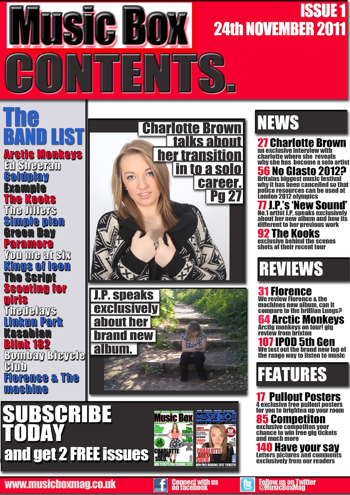
Secondly, Katherine also pointed out that the page number at the bottom of my page was inconsistent with what page the article was listed as on my contents page. The article was listed as starting on page 27, but in the article I had put page 1, This is because during production I had forgotten what page number i had listed it as in the contents so I put it as page one with the view of changing it at a later date, but clearly forgot, which is why i think peer marking and assessment is so important, because Katherine spotted an error in my work that otherwise may have gone unnoticed by myself.
Lastly after making the initial corrections to my double page spread, Katherine and I discussed whether ir not it would be a wise idea to put the interview questions in to a different font colour in order for them to be read easier and make it easier for the reader to differentiate between the interviewers questions, and the artists responses. I agreed with what Katherine said and decided to change the colour of all the interview questions to red so that they would stand out better.

I really think that taking part in peer marking an assesment is an essential part of the production process in magazines, Katherine played the part of what would be called a sub-editor if this were a real magazine. As I said before, it helped me make improvements and spot mistake that i perhaps would not have noticed had I not had somebody else looking over my work. The sub editing process has helped me improve my work and contributed to the growth of my magazine to looking further like a professionally made product.